Here's a preview from my zine, Hell Yes! CSS! If you want to see more comics like this, sign up for my saturday comics newsletter or browse more comics!
 get the zine!
read the transcript!
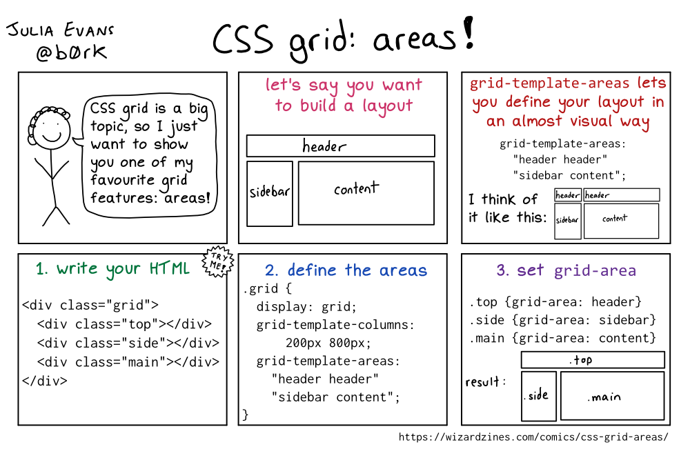
panel 1
Illustration of a smiling stick figure with curly hair.
person: CSS grid is a big topic, so I just want to show you one of my favourite grid features: areas!
let’s say you want to build a layout
Illustration of a long rectangle, labelled “header”. Underneath it are two rectangles, side by side, labelled “sidebar” and “content”
grid-template-areas lets you define your layout in an almost visual way
grid-template-areas:
"header header"
"sidebar content"
I think of it like this:
Illustration of a two rectangles side-by-side, both labelled “header”. Underneath them are two rectangles, side by side, labelled “sidebar” and “content”
write your HTML
<div class="grid">
   <div class="top"></div>
   <div class="side"></div>
   <div class="main"></div>
</div>
2. define the areas
.grid {
   display: grid;
   grid-template-columns: 200px 800px;
   grid-template-areas:"header header"
   "sidebar content";
}
3. set grid-area
.top {grid-area: header}
.side {grid-area: sidebar}
.main {grid-area: content}
result:
Illustration of a long rectangle, labelled “.top”. Underneath it are two rectangles, side by side, labelled “.side” and “.main”