Here's a preview from my zine, Hell Yes! CSS! If you want to see more comics like this, sign up for my saturday comics newsletter or browse more comics!
 get the zine!
read the transcript!
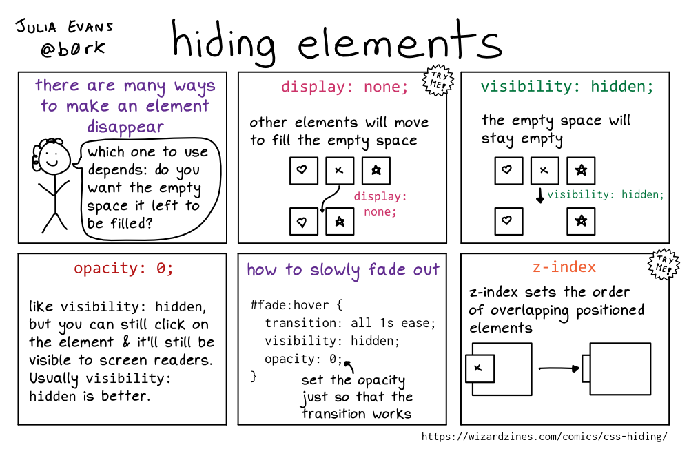
there are many ways to make an element disappear
Illustration of a smiling stick figure with curly hair.
person: which one to use depends: do you want the empty space it left to be filled?
TRY ME: display: none;
other elements will move to fill the empty space
Illustration of three boxes side-by-side, with a heart, x, and star, respectively. When the “x” box is set to display: none;, the heart and star boxes will now be side-by-side.
visibility: hidden;
the empty space will stay empty
Illustration of three boxes side-by-side, with a heart, x, and star, respectively. When the “x” box is set to visibility: hidden;, the heart and star boxes will have a gap between them the size of the “x” box.
opacity: 0;
like visibility: hidden, but you can still click on the element & it’ll still be visible to screen readers. Usually visibility: hidden is better.
how to slowly fade out
#fade:hover {
   transition: all 1s ease;
   visibility: hidden;
   opacity: 0;
}
set the opacity just so that the transition works
TRY ME: z-index
z-index sets the order of overlapping positioned elements
Illustration of two boxes, a smaller one with an “x” in it, that is overlapped over a larger empty box. There is an arrow pointing to a second illustration where the boxes are stacked in the opposite order, so that the small box is underneath of the large box.