Here's a preview from my zine, Hell Yes! CSS! If you want to see more comics like this, sign up for my saturday comics newsletter or browse more comics!
 get the zine!
read the transcript!
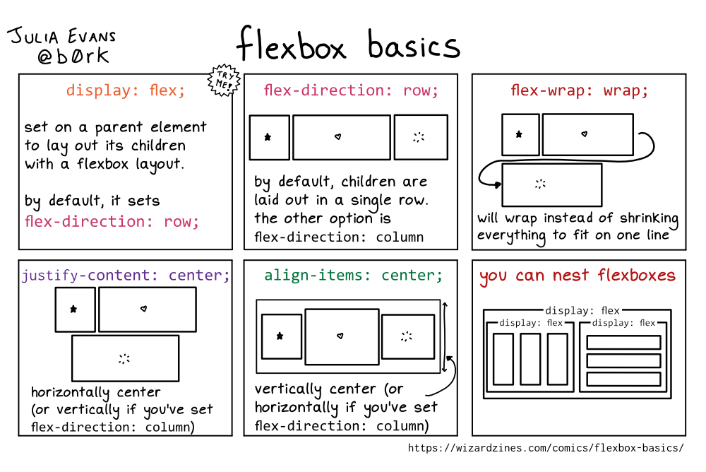
display: flex;
set on a parent element to lay out its children with a flexbox layout.
by default, it sets flex-direction: row;
flex-direction: row;
Illustration of three boxes, one with a star, one with a heart, and one with a starburst. They are side-by-side in a single row.
by default, children are laid out in a single row.
the other option is flex-direction: column
flex-wrap: wrap;
Illustration of three boxes, one with a star, one with a heart, and one with a starburst. The star and heart boxes are side-by-side, then an arrow winds around to the starburst box, which is underneath the other two, aligned to the left.
will wrap instead of shrinking everything to fit on one line
justify-content: center;
Illustration of three boxes, one with a star, one with a heart, and one with a starburst. The star and heart boxes are side-by-side. The starburst box is centred underneath them.
horizontally center (or vertically if you’ve set flex-direction: column)
align-items: center;
Illustration of three boxes, one with a star, one with a heart, and one with a starburst. The boxes are different heights, and are placed side-by-side in a single row, centred horizontally.
vertically center (or horizontally if you’ve set flex-direction: column)
you can nest flexboxes
A box labelled display: flex. Inside it are two smaller boxes, side-by-side. Each is also labelled display: flex. One of the smaller boxes has three boxes side-by-side in it. The other smaller box has three boxes stacked on top of one another, inside it.