Here's a preview from my zine, Hell Yes! CSS! If you want to see more comics like this, sign up for my saturday comics newsletter or browse more comics!
read the transcript!
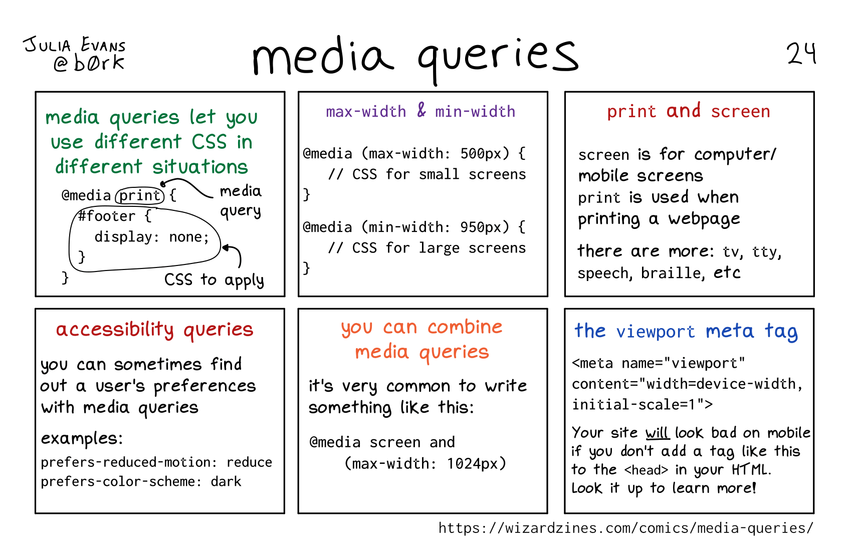
media queries let you use different CSS in different situations
@media print {
   #footer {
      display: none;
}
(print is the media query, and the rest is the CSS to apply)
max-width & min-width
@media (max-width: 500px) {
   // CSS for small screens
}
@media (min-width: 950px) {
   // CSS for large screens
}
print and screen
screen is for computer/ mobile screens
print is used when printing a webpage
there are more: tv, tty, speech, braille, etc
accessibility queries
you can sometimes find out a user’s preferences with media queries
examples:
prefers-reduced-motion: reduce
prefers-color-scheme: dark
you can combine media queries
it’s very common to write something like this:
@media screen and
   (max-width: 1024px)
the viewport meta tag
<meta name="viewport" content="width=device-width, initial-scale=1">
Your site will look bad on mobile if you don’t add a tag like this to the <head> in your HTML. Look it up to learn more!