Here's a preview from my zine, Hell Yes! CSS! If you want to see more comics like this, sign up for my saturday comics newsletter or browse more comics!
 get the zine!
read the transcript!
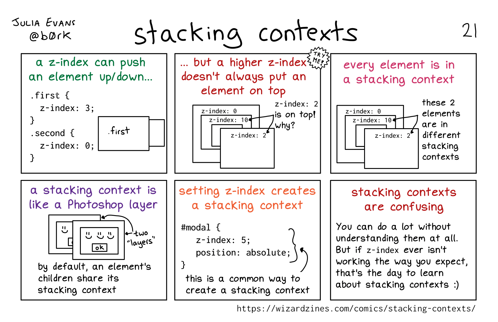
a z-index can push an element up/down…
.first {
   z-index: 3;
}
. second {
   z-index: 0;
}
Illustration of two boxes. The one labelled “.first” is layered over top of the other one.
TRY ME: but a higher z-index doesn’t always put an element on top
Illustration of a box labelled “z-index: 0”. On top of that is a box labelled “z-index: 10”. Another box is on top of that one. Layered over top of all of these is a box labelled “z-index: 2”.
z-index: 2 is on top! why?
every element is in a stacking context
The same illustration as the previous panel, but a label pointing to both the “z-index: 10” and “z-index: 2” boxes says, “these 2 elements are in different
stacking contexts”
a stacking context is like a Photoshop layer
Illustration of two boxes, each with three smiley faces and an “ok” button in it, one layered on top of the other. These are labelled “two ’layers’”.
by default, an element’s children share its stacking context
setting z-index creates a stacking context
#modal {
   z-index: 5;
   position: absolute;
}
this is a common way to create a stacking context
stacking contexts are confusing
You can do a lot without understanding them at all. But if z-index ever isn’t working the way you expect, that’s the day to learn about stacking contexts (smiley face)