
Here's a preview from my zine, Hell Yes! CSS! If you want to see more comics like this, sign up for my saturday comics newsletter or browse more comics!
read the transcript!
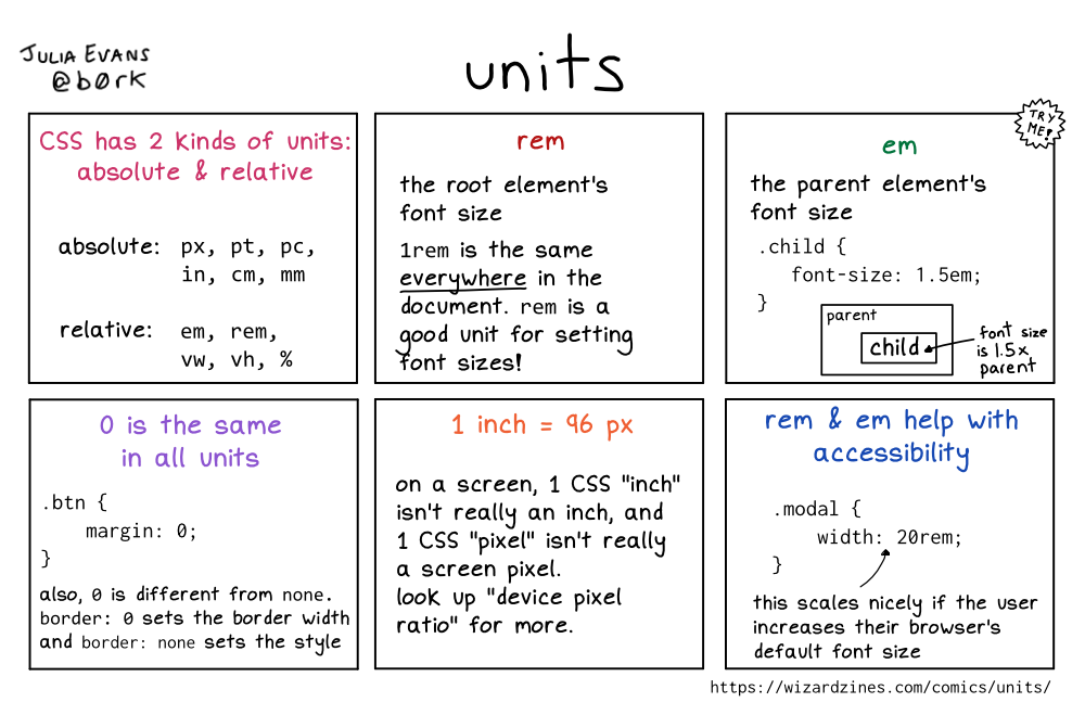
CSS has 2 kinds of units: absolute & relative
absolute:
- px
- pt
- pc
- in
- cm
- mm
relative
- em
- rem
- vw
- vh
- %
rem
the root element’s font size
1rem is the same everywhere in the document. rem is a good unit for setting font sizes!
em
the parent element’s font size
.child {
   font-size: 1.5em;
}
Illustration of a box labelled “parent”. Inside it is a box labelled, in larger text, “child”. An arrow is pointing to the “child” text, labelled “font size is 1.5 x parent”.
O is the same in all units
.btn {
   margin: 0;
}
also, 0 is different from none. border: 0 sets the border width and border: none sets the style
1 inch = 96 px
on a screen, 1 CSS “inch” isn’t really an inch, and 1 CSS “pixel” isn’t really a screen pixel. look up “device pixel ratio” for more.
rem & em help with accessibility
.modal {
   width: 20rem;
}
this scales nicely if the user increases their browser’s default font size